Happy Monday morning! It's a holiday from school here (Martin Luther King Jr. day & a Teacher Workday) so I have all four kids at home today. Wish me luck! I'm taking a few quiet moments to share some things with ya'll...
First, what do you think of my new look? I used an awesome kit from Blue Heart Scraps called "Just Another Day". I love the colors!
Second, I've mentioned before that I'm taking some classes at Hummie's World. One of the classes I'm taking is a filter challenge - it goes through all the filters in Photoshop, challenging you to use the filter to create a LO. Let me say that while I am enjoying learning about all the filters, I can't imaging using many of them in an actual LO. Yesterday I played with the filter called "Photocopy", under the Sketch menu. It has a really fun effect on photos. Here's an example of a recent picture I took of Naomi with the filter applied.
Take a minute and play with a new filter - just be creative!
Showing posts with label Hummies World. Show all posts
Monday, January 16, 2012
Tuesday, January 10, 2012
Hummies World & Color Change Tutorial
I made it one of my 2012 goals to put more on this blog then just CT layouts & Freebies. I also am working on some classes at Hummie World to achieve another goal of learning new things to improve my digital scrapping. So those two goals go well together! I plan to post at least weekly about the things I have learned in my classes.
This week, I was going through Course 1 on photoshop elements - I just wanted to catch those things that I missed in my self teaching of the program. And I was happily surprised right away when I learned a new way to recolor elements. Up until this point, I had been adding a new paper, clipping it, and using the overlay layer. Not incredible effective for a lot of element types. I also know how to use the Enhance:Adjust Color: Replace Color option, but again, it's not easy or effective on a lot of elements.
So in my class this week, I learned to use the Enhance: Adjust Color: Adjust Hue/Saturation feature. LOVE it! Here's an example:
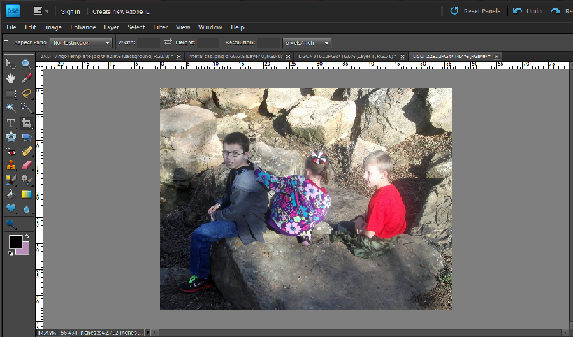
We went on this fun hike through a local park that I wanted to scrap about. But you can see in this original picture that Josh, my youngest son, has on a very bright red shirt and it really didn't work well with the colors of the kit I wanted to use...
So I used my newly learned skills and adjusted the Saturation of his shirt...
Here's the scoop on the Hue/Saturation box...
Hue - Changes the color
Saturation - Changes the shade of the color
Lightness - Changes show dark or light the color is
If you just go into the box and start changing the sliders, it will change the entire picture/element. To change that, use the drop down box and select any of the colors (it doesn't matter which one unless you are specifically targeting a color).
Selecting a color from that pull down menu gives you the option to use the eye dropper. You can (while the box is still open) click on a specific color in your picture/element so any changes you make to the slider focuses only on that color. In my case, I clicked on Josh's shirt so that sliding the saturation slider only effected the colors of his shirt.
That's what I learned! It was a HUGE deal for me - it makes recoloring elements in a kit so simple. Go play with it and see what you can do!
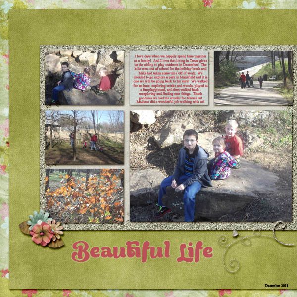
Here's my final layout with this picture...
His shirt blends in so much better with the kit now. I used a new kit from IvoryKeys digital designs called Perfectly Precious that you can grab at With Love Studio.
This week, I was going through Course 1 on photoshop elements - I just wanted to catch those things that I missed in my self teaching of the program. And I was happily surprised right away when I learned a new way to recolor elements. Up until this point, I had been adding a new paper, clipping it, and using the overlay layer. Not incredible effective for a lot of element types. I also know how to use the Enhance:Adjust Color: Replace Color option, but again, it's not easy or effective on a lot of elements.
So in my class this week, I learned to use the Enhance: Adjust Color: Adjust Hue/Saturation feature. LOVE it! Here's an example:
We went on this fun hike through a local park that I wanted to scrap about. But you can see in this original picture that Josh, my youngest son, has on a very bright red shirt and it really didn't work well with the colors of the kit I wanted to use...
So I used my newly learned skills and adjusted the Saturation of his shirt...
Here's the scoop on the Hue/Saturation box...
Hue - Changes the color
Saturation - Changes the shade of the color
Lightness - Changes show dark or light the color is
If you just go into the box and start changing the sliders, it will change the entire picture/element. To change that, use the drop down box and select any of the colors (it doesn't matter which one unless you are specifically targeting a color).
Selecting a color from that pull down menu gives you the option to use the eye dropper. You can (while the box is still open) click on a specific color in your picture/element so any changes you make to the slider focuses only on that color. In my case, I clicked on Josh's shirt so that sliding the saturation slider only effected the colors of his shirt.
That's what I learned! It was a HUGE deal for me - it makes recoloring elements in a kit so simple. Go play with it and see what you can do!
Here's my final layout with this picture...
His shirt blends in so much better with the kit now. I used a new kit from IvoryKeys digital designs called Perfectly Precious that you can grab at With Love Studio.
Subscribe to:
Posts (Atom)